Welcome to another installment of our deep dive into the intricacies of product management. Today, we tackle a pervasive challenge in the world of product management: balancing a feature-rich product with the elegance of simplicity and usability. As a seasoned product leader, I’ve navigated this tightrope time and again, and I’d like to share some key learnings and frameworks that might illuminate the path for others.
Understanding the Dichotomy of Feature-Richness and Simplicity
To begin, let’s establish what we mean by ‘feature-richness’ and ‘simplicity’. A feature-rich product is stacked with functionalities that cover a wide range of user needs. Simplicity, on the other hand, refers to a product’s ease of use and the clarity of its user interface and experience.
At first glance, these concepts might seem mutually exclusive. More features can often lead to complexity, which can intimidate or overwhelm users. Simplicity suggests a minimalistic approach, which can sometimes lead to cutting out potentially valuable features. So, how do we find the balance?
The Feature vs. Usability Framework
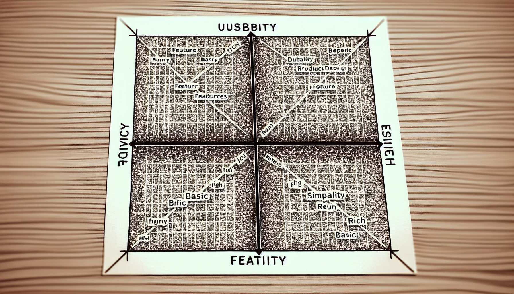
One of the frameworks I’ve found invaluable is the Feature vs. Usability Matrix. Picture a simple quadrant graph where one axis represents the number of features and the other represents usability. The ideal product would sit in the top right quadrant, high on both axes. But getting there is the real challenge.
Prioritize User Needs and Problems
Early in my career, I oversaw the development of a project management tool. It was tempting to add every imaginable feature to compete with heavyweights in the market. However, through user research, we unearthed that what our target audience truly valued was a streamlined workflow that could be learned quickly. So we prioritized simplicity over a plethora of features, which paid off in user adoption and satisfaction.
Actionable Steps:
- Conduct thorough user research to identify the core problems your product aims to solve.
- Map out the features that directly contribute to solving these problems.
- Evaluate each additional feature for its actual value to the user experience.
- Prioritize and develop the essential features first to build a strong, simple foundation.
Embrace ‘Progressive Disclosure’
In my experience, the concept of progressive disclosure is a game-changer. This design strategy involves showing users only the information and features they need when they need them, avoiding information overload and promoting simplicity.
For instance, an analytics dashboard product I managed initially presented users with a barrage of graphs and stats on the main page. By applying progressive disclosure, we redesigned the dashboard to show top-line metrics upfront, with the option to drill down into more detailed information on demand.
The Minimal Viable Product (MVP) Approach
Drawing from the lean startup approach, I’ve consistently found value in launching with a Minimal Viable Product. It forces the team to focus on the core functionality and to iterate based on real user feedback, which often highlights the balance between features and usability. Afterward, we could decide which features were truly essential.
Continuous Iteration and User Feedback Loops
Your product is never ‘done’. The balance between features and simplicity should be continuously assessed. At my first startup, we created a loop where every additional feature went through A/B testing and usability sessions.
Implementing the Loop:
- Develop a hypothesis for how a new feature improves the product.
- Build a minimum viable version of the feature.
- Test this feature with a subset of users.
- Gather and analyze feedback.
- Iterate on the design based on this feedback or decide to remove the feature.
Conclusion
The balance between feature-richness and simplicity is a dynamic equilibrium. It requires continuous attention and a deep understanding of your users’ needs and behaviors. By prioritizing user problems, embracing progressive disclosure, applying the MVP approach, and establishing a strong feedback loop, you can create products that are both powerful and accessible.
Remember, the goal is not to create a product that can do everything, but rather a product that does the most important things exceptionally well. It takes discipline, user insights, and often, the courage to say no to feature bloat. In the end, a harmonious balance will lead to a product that resonates with users and stands the test of time.

